Reprinting/restoring/recoloring vintage comics and Jack Kirby’s Fourth World

[12 Dec 2023 note: This blog has been dormant for many years, more or less starved by the rise of social media like the rest of the blogosphere. It was long dead by 2019, when I briefly joined a private old-school message board created by Douglas Wolk as a book club to discuss the wide history of Marvel Comics, in preparation for his excellent 2021 book All of the Marvels: A Journey to the Ends of the Biggest Story Ever Told. The first day’s reading was Fantastic Four #51 (Jun 1966), one of the pinnacles of the Marvel Universe’s first flagship. Immediately we sprang into a discussion of which version of that endlessly-reprinted comic to read, and how the various physical and digital editions over the years had obscured or enhanced the details of its craftsmanship. Kate Willaert posted some fascinating side-by-side comparisons, of which I’ll just reproduce one example here:

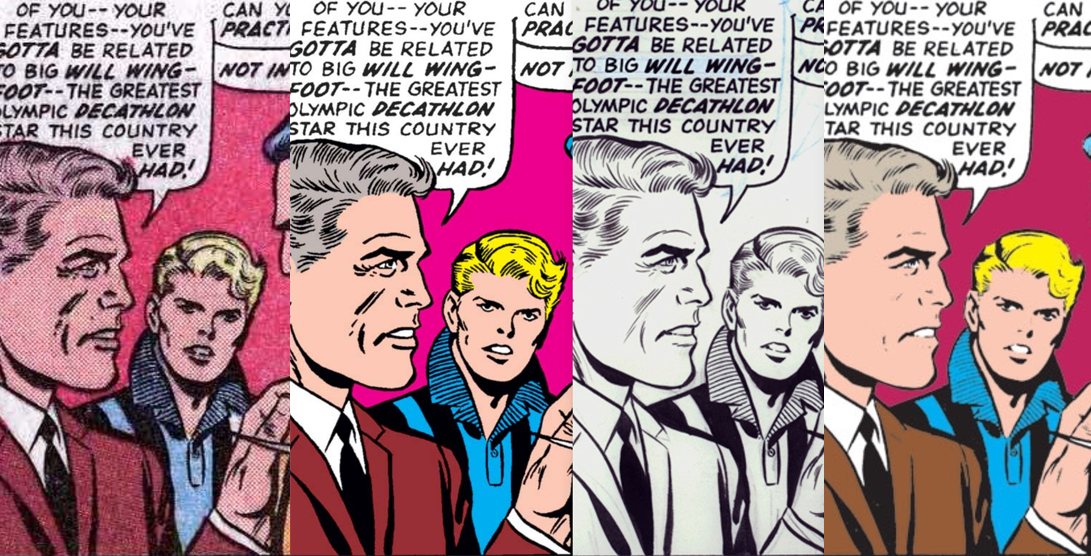
(L-R: scanned original printing of Fantastic Four #51 / digital edition on Marvel Unlimited as of Jan 2019, which Willaert says must have been re-inked by some restorationist without access to the original art / scan of the original art board / an earlier digital version offered by Marvel. Script by Stan Lee, pencils by Jack Kirby, inks by Joe Sinnott, lettering by Artie Simek. Compilation by Kate Willaert)

On 4 Jan 2019, I chimed in with a response that I want to preserve outside of that paywall-gated message board, and here is as good a place as any.]

———

This gets pretty quickly into fundamental Philosophy of Art questions – which is the “real” “original” version? Which best reflects the authors’ intentions? What “should” it look like? The simplest answer, IMHO, is that there is none. These are commercial stories created for mass reproduction, by an assembly line of creators & technicians & printing presses, and every stage has its pros & cons.

The B&W inked original art boards (many of which survive from this period, though definitely not all, and some of which are thankfully accessible to us thanks to IDW’s “Artist’s Edition” series) have the most visual detail and best showcase the hand of the inker, but they lack color and often have unsightly tape/glue stains, seams from lettering paste-ups, pencil marks, or other elements that were disappeared in publication. These boards are generally the most jaw-dropping images, but nobody who made them ever imagined they would be seen by the public. And honestly, with the superhero genre, missing the color is missing an awful lot of the appeal!

The vintage comic book is the actual product that landed in the public’s hands, so it’s theoretically the result that the creators had in mind when making it. And it’s the format that had the actual cultural impact at the time. But it’s the cheap product of a 4-color newsprint press, so there can be registration errors (where some of the color plates are misaligned by a millimeter or so), misprints, and even variations between different copies of the same issue. They’re significant smaller than the originals, and some detail is inevitably lost. Plus: after 50 years this cheap paper has aged and yellowed! We can’t see them exactly as they looked on the newsstand.

Subsequent reprints over the decades can vary widely — did they re-use the original 4-color film? Reconstruct the images using newer technology? Lose the colors and do B&W only, like the Marvel Essentials line? Scan it from vintage comic books? Print it on different paper stock so the colors look different? Make high-resolution scans of the art boards and meticulously colorize them to create a Frankenstein edition that looks “better” than the original ever did? Etc. Lots of decisions that the editor & publisher have to think about, and readers can consider as well.

And most of those questions arise again with digital editions, with new wrinkles that come from reading on a screen. A CMYK color setting that looks muted on newsprint can be screamingly vivid on screen. Higher resolution allows for more detail, but there’s a trade-off for file size and loading speed.

My favorite example to point to for different restoration strategies (in a single book!) is the Kirby’s Fourth World Omnibus edited by Anton Kawasaki in 2007-2008. The dust jacket to Volume Three features 1971 line art completely recolored by superstar colorist Dave Stewart in a modern painterly (but still tasteful) style:

When you remove the jacket, the glossy hardcover underneath is an extreme blowup of a scanned issue from 1971, where the Ben-Day color dots and registration errors are in your face:

But for the interiors of this edition, DC commissioned Drew R. Moore and Dave Tanguay to go through and digitally reconstruct all the colors as smooth flat fields that fit precisely within the lines, and it’s printed on a sort of “deluxe newsprint,” resulting in an interesting “best of both worlds” that I quite like, although some may miss the Ben-Day dots:

I really love that the designers allowed for this multiplicity of versions to co-exist. It feels honest.

———

[and a follow-up post later that day:]

Silver Age Kirby at least has a fairly coherent aesthetic, so you can make one master decision about how you’re going to treat it, and implement it pretty consistently.

If you look at something like Neil Gaiman’s SANDMAN, it sort of begins in one era and ends in another, spanning some major transitions in comic art production (as Gaiman discusses in this 2006 blog post). So restoration projects like the 2006-2008 ABSOLUTE SANDMAN (which commissioned Daniel Vozzo and other colorists to bring the first 18 issues more in line with the digital style of later issues – a couple examples here) can be pretty controversial. And it would look even weirder if they tried to revise the later issues to match the early ones!

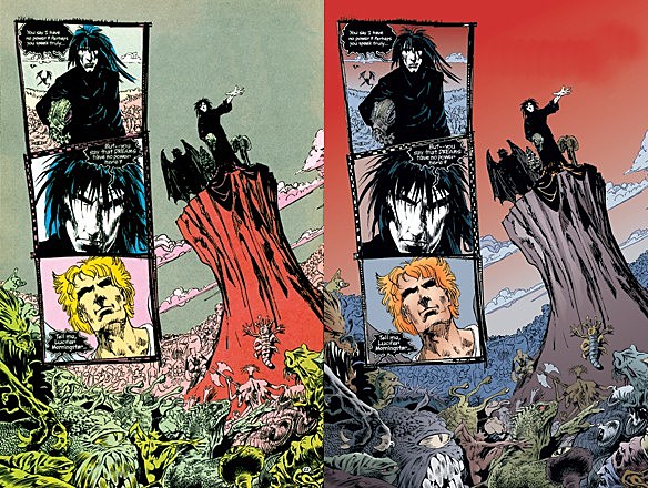
(L-R original version of a scene from The Sandman #4 dated Apr 1989, and the same page in The Absolute Sandman published Nov 2006. Script by Neil Gaiman, pencils by Sam Keith, inks by Mike Dringenberg, lettering by Todd Klein, original colors by Robbie Busch, revised colors by Daniel Vozzo.)

Personally, I’d be very curious to see a lot of post-90s work meticulously reconstructed with bold, limited colors, to see what treasures might be salvaged from the abuses of digital gradients and the paint-it-brown mentality.

Unfortunately, it’s rare for any comic to be popular enough to justify investing the time & money on a major restoration at all. Maybe Marvel should release a huge trove of files to art schools and let students practice their coloring techniques.

Infinite Summer 2011


Infinite Jest book covers

or, Finally Reading the Greatest Book, Like, Ever, in 92 Days

Some time ago I encountered Infinite Summer, an internet book club project wherein a broad assortment of readers around the world read and discussed David Foster Wallace’s Infinite Jest over the summer of 2009. Either I discovered the project too late, or I wasn’t ready to tackle it, but for lots of reasons, I feel ready now. This is the year.

Why Infinite Jest? I’ve heard enough about it (and read enough bits of Wallace here and there) that I’ve known for a long time that this needed to happen. It’s not just the most acclaimed novel in a billion years, it seems to be a book tailor-made for me. I hope not to become one of those insufferable dudes who can’t shut up about it, but I’m ready to at least become a dude who has read it. If you’re also ready to cross this monster off your bucket list, join me.

How to Read Infinite Jest? Matt Bucher has a useful list of tips by that title. Jason Kottke has too. Most importantly: read the endnotes, use multiple bookmarks, and don’t give up.

But I Don’t Have Time! Yeah, me neither. But I’m gonna make time. It’s 10 pages a day. And your TV shows are over now anyway. Now are you gonna stand there with your butt on the back of your body or are you gonna get in on this?

What’s the Plan? Well, I’m not an army of bloggers, so I’m making it up as I go along. I doubt I’ll blog about it here very much, but I’ll probably tweet about it. Some other folks had the same idea independently, although their rough schedule is a little different than mine. Here’s a chart of roughly where I plan to be at the end of each day:

[every print edition of IJ has the same pagination. This doesn’t count the 100 pages of endnotes, which will be read along with whatever section they belong to. If you’re on a Kindle, you’re on your own – though the Infinite Summer 2009 schedule may help.]

Continue reading ‘Infinite Summer 2011’

Brecht Evens’ THE WRONG PLACE

I’m hardly an impartial commenter, since I’m promoting a comic book by Brecht Evens coming out in March, but I thought Sean T Collins pulled some great insights from the man (and made some great observations himself) in their interview here for Robot 6 about his very impressive book THE WRONG PLACE.

Personally, after getting over the initial moment of visual confusion, I thought the book did a stellar job of making the real-life experience of city nightlife (gossip, dancing, dinner parties, one-night-stands) look as magical as it sometimes (rightly or wrongly) feels.

Simon Reynolds on fandom

I think I’ve met them all now. For me, there are no more heroes left. And no new ones coming along, by the look of it. It could be that this is a time marked by a dearth of characters, or that the smart people in rock aren’t interested in self-projection but in obliterating noise. But really, I think, it’s the case that, in this job, you don’t have the time to develop obsessions, what with the insane turnover, and all the incentives to pluralism.

The heroes you have kind of linger on from a prior period when only a few records passed through your life, when you had time to get fixated, spend days living inside a record. It’s a real effort to click back to that frame of mind, which is bad because fanaticism is the true experience of pop – I think of the splendid devotion of all those bright girls who, as soon as they’ve got hold of the new Cure or New Order or Bunnymen record, immediately set to learning the lyrics by heart then spend days exhaustively interpreting the Tablets From On High, struggling to establish some fit between their experience and what is actually some drunken doggerel cobbled together in a studio off-moment.

Seriously, I approve. I approve the deadly seriousness, the piety, the need for something sacred in your life. However deluded.

It’s become a reflex for critics to castigate the readers for being partisan, for being sluggish and single-minded in their choices. We exhort you to disconnect, discard, and move on, acquire a certain agility as consumers. But maybe this ideal state of inconstancy we advocate only makes for fitter participants in capitalism. For the one thing that makes rock more than simply an industry, the one thing that transcends the commodity relation, is fidelity, the idea of a relationship. There are voices that you turn to as a friend, and you don’t just turn your back on your friends if they go off the rails. You hang around.

–Simon Reynolds, Melody Maker, March 12, 1988

ABA, DOJ, BBQ

Most of the “shop indie bookstores / fight the big box chains” rhetoric I’ve heard has been rooted in a vague all-purpose anti-corporate sentiment rather than concrete concerns. This recent letter from the American Bookseller Association to the US Department of Justice is useful in spelling things out:

Publishers sell these books to retailers at 45%-50% off the suggested list price. For example, a $35 book, such as Mr. King’s Under the Dome, costs a retailer $17.50 or more. News reports suggest that publishers are not offering special terms to these big box retailers, and that the retailers are, in fact, taking orders for these books at prices far below cost. (In the case of Mr. King’s book, these retailers are losing as much as $8.50 on each unit sold.) We believe that Amazon.com, Wal-Mart, and Target are using these predatory pricing practices to attempt to win control of the market for hardcover bestsellers.

It’s important to note that the book industry is unlike other retail sectors. Clothing, jewelry, appliances, and other commercial goods are typically sold at a net price, leaving the seller free to determine the retail price and the margin these products will earn. Because publishers print list prices indelibly on jacket covers, and because books are sold at a discount off that retail price, there is a ceiling on the amount of margin a book retailer can earn.

The suggested list price set by the publisher reflects manufacturing costs – acquisition, editing, marketing, printing, binding, shipping, etc. – which vary significantly from book to book. By selling each of these titles below the cost these retailers pay to the publishers, and at the same price as each other, and at the same price as all other titles in these pricing schemes, Amazon.com, Wal-Mart, and Target are devaluing the very concept of the book. Authors and publishers, and ultimately consumers, stand to lose a great deal if this practice continues and/or grows.

What’s so troubling in the current situation is that none of the companies involved are engaged primarily in the sale of books. They’re using our most important products– mega bestsellers, which, ironically, are the most expensive books for publishers to bring to market–as a loss leader to attract customers to buy other, more profitable merchandise. The entire book industry is in danger of becoming collateral damage in this war.

More at the link.

It’s a messy situation all around (from a publisher’s perspective, the chains are skimming off the “sure things” rather than supporting the whole line; from an indie store’s perspective, they’re hogging all the books that bring people in the door and making it impossible for small stores to use them; from Wal-Mart’s perspective, they’re just trying to get books to people as affordably as possible, and they only want to carry the items their customers are interested in), but it’s nice to hear facts rather than vague suspicion.

EDIT:
Techno-optimist Clay Shirky offers commentary, calling these “arguments that made some sense twenty years ago, but have long since stopped doing so.” Instead, he proposes that booksellers begin “treating the old side-effects” — i.e. the physical amenities that bookstores uniquely provide in addition to selling books — “as the new core value.”

First thoughts on Oscar Wao

Junot Díaz
The Brief Wondrous Life of Oscar Wao
Riverhead, 2007

I really enjoyed Díaz’s voice here — even beyond the geek references, his writing has a clever & confident conversational elegance — and the content was often absorbing, but I was disappointed to find that the parts didn’t add up to a whole.

Díaz introduces us to Oscar, then looks elsewhere, only to return occasionally — so that this Life of Oscar is missing its main character for at least half the book. Díaz also declines to allow Oscar to grow. Is he crippling his novel’s potential power, or boldly avoiding cliche? I can imagine some defenses here — to read it as a tragedy (it’s the pathos, stupid, not the character development), and place it in a context of stories like Jaime Hernandez’s Death of Speedy Ortiz (in which the titular climax is never shown, only hinted at, and the title character’s importance is shown only through his effect on friends and family). But I’m still left feeling unsatisfied.

The much-discussed geek references are thrilling to geek readers who have never encountered them in a Pulitzer-winning novel before, sort of like hearing characters swear on early South Park. On a few occasions they really add another dimension of meaning to a real-life scene, or conversely demonstrate the depth of feeling previously unnoticed in lines from a campy old Stan Lee script. I wish this happened more often; usually they’re more superficial. Obviously Oscar gets a lot out of his fandom, but I don’t think Díaz ever really explores what he’s getting or how that works.

The most successful characters are the women. It’s especially rewarding to move around in time and have the past deepen our understanding of the future. As we learn about the tortures that shaped each stubborn young woman into a haunted matriarch, we begin to love and forgive them.

A couple formal things threw me — is Yunior narrating the whole book? Why is one (and only one) chapter narrated in Lola’s voice (after a brief second-person introduction in italics)? How is the story enhanced by the revelation that we’re hearing all this from a guy who sort of knew some of the characters in college? If hearing Yunior say “I guess I could have handled that better, but in the end I didn’t, oh well” makes the book more realistic, but less satisfying, are we better off?

Díaz is a joy to read; I’d love to see him do non-fiction, especially arts criticism. He knows a lot about people, and books, and what they can do to each other. I really wish this one had come together for me.

the French for “grenade” is “grenade”

Michaela Colette Zacchilli’s recent entry on Rob Goodin’s awesome Covered blog has got me reminiscing about Mark Texeira.

(images below from Texeira’s own site; go visit him)

I’m showing my roots here: I came of age reading Marvel comics in the mid-90s, and one of my favorite mini-series was the unfortunately titled Sabretooth: Death Hunt, created in 1993 by Larry Hama and Mark Texeira. A lot of Marvel’s work during that period is absurdly inconsistent, but there’s some good stuff lurking in the mini-series (if only because the consistent creative team and clearly-defined parameters mean that you get a coherent artistic statement).

sabretooth_interior_0 sabretooth_interior_3

Texeira’s art here is like a bizarre hybrid of Frank Miller, Todd McFarlane, and Rob Liefeld — often pretty close to the filthy lumpy style of Sam Kieth (apparently they both worked on Marvel Comics Presents in ’90-91). Hama’s over-the-top script is matched by a ferocious energy on the part of Texeira, as befitting a Sabretooth story. I think the first issue has Sabretooth coming home to find his mansion overrun by ninjas (it happens), so he and his personal assistant have to shred and blast their way through a couple hundred ninjas before settling down to dinner or something.

sabretooth_interior_4 sabretooth_interior_5

Issue three had Wolverine in a suit. Who draws Wolverine in a suit?! I love it.

sabretooth_interior_9

The other reason I wanted to mention this is not Texeira exactly, but rather the cover:

sabretooth 1

It was the age of gimmicks, so the cardstock cover is die-cut to reveal a painting of the titular character (I have a MMPB airport thriller from 1995 that does the same thing). But the whole thing is actually kind of admirably restrained — would Marvel run something like this today? — and I especially want to appreciate the text layout in the sidebar to the left.

This sort of type-play is a very early-90s graphic design idea, made possible by the rise of desktop publishing software and digital typography. And in most cases it doesn’t age well, now that the novelty has worn off. But here it’s pretty restrained, keeping everything right-side-up and using only 2 or 3 font families. I remember seeing the same design used in a bunch of house ads for “Bloodties,” the X-Men/Avengers crossover from 1993. I’ll have to dig those out sometime: the story itself was forgettable, but those house ads (I’m remembering punch-out trading cards with pull-quotes from Nick Fury commenting on various characters) made the whole thing sound immensely important.

Hey, I was seven.

But I’m still fond of the design.

on Golden Ages

Eddie Campbell’s recent post on varying perspective includes a tangential reference to Alex Raymond and includes an example from Raymond’s short-lived collaboration with Dashiell Hammett, Agent X-9 (1934-35).

Check out this action sequence:

Raymond X-9 strip by Dashiell Hammett and Alex Raymond

Agent X-9 strip by Alex Raymond (June 8, 1934?)

Jack Kirby gets so much attention as an action innovator that I’ve been trained to think of pre-Kirby action comics as dry and lifeless. Marvel’s marketing efforts have a lot to do with this; Lee and Buscema in How to Draw Comics the Marvel Way (1978) spend many pages explicitly drawing attention to the ways in which the revolutionary “Marvel style” (created in the 1960s by Kirby) uses extreme angles to make each panel more exciting.

From How to Draw Comics the Marvel Way by Stan Lee and John Buscema. On the left, a conversation drawn as any comic book company might present it. On the right, the same conversation presented in the Mighty Marvel Manner!

From How to Draw Comics the Marvel Way by Stan Lee and John Buscema. On the left, a conversation drawn as any comic book company might present it. On the right, the same conversation presented in the Mighty Marvel Manner!

It’s interesting to see Raymond demonstrate here that it is possible to get a lot of energy and power out of a scene without upsetting the steady POV.

Like this gallery of Action Comics covers (of which Joe Shuster’s are my least favorite), it makes me wonder at all the hoopla regarding Batman and Superman when the real 1930s action was happening elsewhere.

Transformers: Revenge of the Fallen

I actually enjoyed the first Transformers movie quite a bit. I think the sequel may be the worst movie I’ve ever seen. It fails on every conceivable level. People will tell you it’s just a big dumb glorious action movie. Those people are wrong. There are half-hour stretches in which NOTHING HAPPENS, as though the writers were stumped about what to do next, and left to go think of something — but LEFT THE MOVIE RUNNING while they did so. At no point in the making of this film was the question “why?” ever asked, by anyone. Nothing matters, nothing makes sense, and not even the explosions are interesting. Not sexy, not funny, not thrilling. And did I mention three hours long? Please, go watch Armageddon or Die Hard 4 or something. Save your money.

That was the most surprising part — that the movie would fail so completely at even being an entertaining summer action flick. Other, ancillary frustrations:

  • The pervasive neocon ideology. Aside from the military boosterism (expected from Michael Bay), there is literally a scene where the White House spokesman yells at Optimus Prime and over the course of the argument, the terms “planet Earth” and “United States” are thoroughly conflated. Because they’re the same thing, you see.
  • Transformers, the franchise, was designed to sell toys. The TV shows and comics understood this, and made the most of it — they clearly diagrammed who was who, gave all the transformers distinct personalities, and made you fall in love with them, so that you would want to own them. After watching Revenge of the Fallen I can’t even visualize more than three or four of the 30+ featured transformers, let alone name them or describe their personalities. What are kids supposed to do? “Thanks, mom! It’s… Sideswipe? Remember him from that half a frame he was in during that one explosion scene?” You couldn’t follow this with a scorecard.
  • The “twins” are every bit as bad as you’ve heard.
  • One of the “themes” of the film (if there are any, there are like twelve, all stillborn like a litter of malnourished puppies) is that being an Autobot or a Decepticon is not an inborn characteristic (like race) but a choice (like religion). At least two characters, the biggest and the smallest, are shown to switch sides and become “good guys.” This adds a horrific angle to the already-disturbing scene near the beginning, where the US military-Autobot alliance is shown hunting down a fugitive Decepticon (who is never shown doing anything wrong) and killing it in cold blood.
  • I can’t emphasize enough how incoherent the screenplay is. You know how there were twelve Superman scripts floating around Hollywood, all wildly incongruous, before they eventually picked Superman Returns? This is like they took a dozen Transformers 2 screenplays, put them in a Large Screenplay Collider, and fired them at each other at a considerable fraction of lightspeed. Then they picked up the pieces and filmed the result. You can almost make out the remains of Jon Peters’ giant robotic spider. For more on Michael Bay’s ecstatic transcendence of logic, see Rob Bricken at Topless Robot:
  • What follows is the most spectacular part of the movie, as Sam and Mikaela try to run the several miles back to the military camp during a massive Decepticon attack where the military has dropped Optimus Prime’s corpse.
    Why is that awesome? They could drive back in one of the Autobots and be there in a minute or two.
    They don’t do that.
    What?
    They walk.

EDIT: And another thing!

I want this guy to pop out at the end of every scene of every movie and explain how we are supposed to feel about what just happened. Just like he does in Transformers: Revenge of the Large Screenplay Collider.

in a supreme irony, it took me forever to compose this

By and large, Rolling Stone may be the poster child for the obsolescence of the print magazine, but one thing they’re still good at is the in-depth, Cameron-Crowe-style artist profile.

Reading through Mark Binelli’s Lil Wayne profile in last month’s issue, we learn a few facts about the “best rapper alive”:

  1. Lil Wayne is always stoned.
  2. Lil Wayne releases tons of music for free over the internet.
  3. Lil Wayne goes to a recording studio every day.

Now, I don’t know what to make of the first one (as I understand it from the article, he literally chain-smokes weed. His assistants roll blunts and put them in packs which he carries on him at all times. Like Lyle and Ray’s Perfect Jays.). But #2 and #3 made me think:

Lil Wayne is to music as webcomics are to comics.

It was #3 that surprised me, but it’s starting to make a lot of sense. Studio time is expensive if you are a garage band, but not if you have the #1 album in the world and you own a dozen studios. It’s also pretty easy to do it yourself these days, even for garage bands. And if you are prolific and talented and like making music, why would you ever not be recording?

It’s a completely opposite model to the standard rock process (write songs privately, spend intense time in the studio perfecting the recording, then release your finished masterpiece into the canon). In music, call it the U2 or Zeppelin model. In comics, think of Craig Thompson or David Mazzucchelli.  It’s also distinct from the corporate deadline/assembly-line model, exemplified by the early pop singles industry, the syndicated comic strip, or the Big Two comic book.

Instead, it’s what people have been saying about the Internet for years: removal of middlemen, instant delivery, zero barriers between creation and distribution. Lil Wayne (or Randall Munroe) has an idea, he gets on his computer, he lays it down, he clicks a button, and 50 million people download it.

Art as blog.

Andrew Sullivan (who does more or less the same thing for political commentary) has written thoughtfully on blogging:

The blogosphere may, in fact, be the least veiled of any forum in which a writer dares to express himself. … The wise panic that can paralyze a writer—the fear that he will be exposed, undone, humiliated—is not available to a blogger. You can’t have blogger’s block. You have to express yourself now, while your emotions roil, while your temper flares, while your humor lasts

Apparently Wayne doesn’t even write his lyrics down anymore, he just records whatever comes to him during his (again, daily) recording sessions. Webcomic creators like Chris Onstad and Jeph Jacques improvise on a similar day-to-day basis.

And that’s what makes blogging as a form stand out: it is rich in personality. The faux intimacy of the Web experience, the closeness of the e-mail and the instant message, seeps through. You feel as if you know bloggers… When readers of my blog bump into me in person, they invariably address me as Andrew. Print readers don’t do that. It’s Mr. Sullivan to them.

That matches my impression of both webcomickers and Lil Wayne: the immediacy and unmediatedness of their work is intoxicating, and they blur the line between personal diary and product, between friend and fan (with sometimes frightening results).

I hasten to add that I don’t think this is the sole future of artistic or literary production. It’s just one part of the cultural ecosystem. We will always need thoughtful, well-crafted, large-scale pieces in every medium. Some creators are better suited to one type or another (God knows if we were all bombarded with Twitter updates and Myspace diss tracks from Bono or Thom Yorke we’d shoot ourselves in the face). Some can tackle both, just as Sullivan finds time apart from his blog grind to compose the occasional essay or book.

But as for the New York Times’ much-mocked anxiety about the upcoming xkcd book — if this comparison holds, Munroe doesn’t have much to worry about.


Leigh Walton talks comics and maybe other arts. (RSS)
He also works for the very excellent publisher Top Shelf Productions (which does not necessarily endorse the views and opinions, etc, herein).

Categories

Header by me. Contains an interpolation of the final panel from All-Star Superman #1 by Grant Morrison and Frank Quitely. Speaking of which.